Lundgren+Lindqvist
Lundgren+Lindqvist is a Gothenburg-based design and development studio founded by Andreas Friberg Lundgren and Carl-Johan Lindqvist. The studio combines conceptual clarity with technical precision, delivering work that bridges graphic design, branding, and digital craftsmanship. Known for its meticulous attention to detail and strong typographic sensibility, Lundgren+Lindqvist collaborates with clients across culture, fashion, and technology. Their portfolio includes projects for Hasselblad, Acne Studios, and The Gothenburg Museum of Art. The studio’s work has been internationally recognized, earning awards from D&AD and the Type Directors Club.
![]() https://www.lundgrenlindqvist.se/
https://www.lundgrenlindqvist.se/
![]() 347 Cases
347 Cases
Known for:lundgren+lindqvistswedish designeditorial designbrand identitybook designvisual identity
Cases
- Unknown Client
- Logo Collection For Architectural Firms
- Unknown Client
- Logo Collection For Various Clients
- Unknown Client
- Publication Design For Coloring Your Brand

- Unknown Client
- Publication Design For Brewed For Taste

- 4ark
- Editorial Design For 4ark Publication

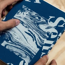
- A Sense Of Place
- Editorial Design For A Sense Of Place Book
News & interviews
Clients
Tech Stack
Technologies detected on Lundgren+Lindqvist's website.