UnderConsideration’s Brand New section briefly reports on the unveiling of a new logo for the Federação Portuguesa de Futebol. The post, categorized as 'Spotted', notes the change but does not include detailed commentary or design analysis.
Brand New briefly features the 'Two-way Street' identity project in its Linked section. The post, authored by Armin, highlights the project without detailed commentary or visuals, serving as a short mention rather than a full review.
UnderConsideration’s Brand New briefly notes Sonder Studio’s redesign of the Veritas logo and brand identity. The project, for a German real estate company, features a flared serif logo and updated visual identity. The article is part of the site’s 'Noted' category, offering a short mention rather than a full review.
Berlin-based studio True Arrow created a new brand identity for biotech company Cambrium, inspired by molecular building blocks. The rebrand uses modular 3D forms, precise typography, and motion to express the company’s innovative material science. The system integrates scientific precision with tactile, expressive design to make Cambrium’s advanced technology feel both credible and alive.
Under After created a new brand identity for Reasoning Project, a venture firm founded by Michelangelo Pagliara and Juhana Peltomaa. The identity balances human warmth with technological credibility through a hand-drawn 'R', refined typography, and motion-led art direction. The design emphasizes restraint, timelessness, and the idea of reasoning as the new scarcity in the AI era.
The article profiles photographer Silvana Trevale’s decade-long project 'Venezuelan Youth', a photographic series documenting the lives of young people growing up amid Venezuela’s economic and social crisis. Now published as a book by Guest Editions and designed by Rizardo Baez, the project explores identity, resilience, and belonging through intimate portraits and documentary imagery. Trevale reflects on her evolving relationship with her homeland and how the work has helped her reconnect with her Venezuelan roots.
The article covers The Poster Festival in Warsaw, a major event exploring both Poland’s graphic design heritage and new experimental poster art. It highlights exhibitions like 'Not the Artist' by Kuba Sowiński and 'Polish Female Graphic Designers 1945–1989' curated by Alicja Kobza, revealing the country’s deep poster tradition and its evolving dialogue with AI and authorship. The piece reflects on Poland’s unique graphic culture and its contemporary reinterpretations.
The article profiles Los Angeles designer Rachel Many and her project 'Mother Load', a poster and essay series visualising the economic and emotional toll faced by creative mothers. Through sharp, conceptual imagery and data-backed commentary, Many exposes systemic inequities in the creative industry, particularly amid recent job cuts and AI-driven pressures. The feature positions her work as both a critique and a call for awareness within the design community.
Love & War created the brand identity for Shaver Hall, a new food and cultural destination inside the historic Lord & Taylor building on Fifth Avenue. The project draws inspiration from Dorothy Shaver, the department store’s pioneering president, blending heritage architecture with playful, modern campaign visuals. The result balances history and contemporary energy, showing how naming and storytelling can revive a landmark without losing its soul.
After being rejected from over 550 design jobs, Edinburgh-based designer Harry Matuszewicz-Milne founded Acid House Designs, a studio embracing bold, unconventional interiors. Drawing inspiration from rave culture and pop art, his work challenges the industry's preference for neutral minimalism. The article highlights his journey from rejection to self-started success and his argument for distinctiveness as a commercial advantage.
The article covers artist and designer Ben Sanders’ talk at Nicer Tuesdays Los Angeles, where he discussed his surreal and experimental art practice. Sanders shared insights into his self-publishing approach, use of unconventional materials like salt and pool noodles, and his collaborations with major clients such as Nike, Louis Vuitton, and Bloomberg.
Designer and researcher Mindy Seu presented her project 'A Sexual History of the Internet' at Nicer Tuesdays in Los Angeles. The talk explored the erotic and visual history of the internet through an interactive slideshow hosted on Are.na, touching on themes like cybersex, teledildonics, and creative profit-sharing. The event highlighted Seu’s ongoing interest in cyberfeminism and digital culture.
The Dieline’s July 2026 'Pack of the Month' spotlights SODAA’s refined packaging refresh for Australian coffee brand Dukes Coffee. The redesign emphasizes timeless elegance through a blind debossed wordmark and minimalist aesthetic, standing apart from the current wave of maximalist CPG design. The project reflects SODAA’s focus on restraint and sophistication in brand evolution.
The article profiles Paris-based illustrator Ayame Uchima, whose intricate lace-inspired drawings blur the line between textile craft and illustration. Trained in Lunéville embroidery, Uchima translates her fascination with lace-making into imagined, threadlike compositions that evoke both beauty and unease. The piece explores her process, inspirations, and the tactile precision behind her work.
The Motionographer article by Jesse Rylander profiles filmmaker Hao Wu and his 2026 Tribeca Festival documentary 'TikTok Never Dies'. The film explores the creative and political tensions surrounding TikTok, examining how algorithmic control and platform dependency affect creators. Wu discusses his process, visual design challenges, and the broader implications of building creative careers on corporate platforms.
The article spotlights Holy Studio’s packaging design for Unbridled Spirit Bourbon, which reimagines traditional bourbon aesthetics through a refined, sculptural bottle and restrained luxury details. The design replaces typical rustic cues with a modern, poetic approach that reflects the brand’s equestrian heritage without overt symbolism.
The Dieline’s June 2026 roundup highlights notable packaging and branding stories, including Pirate’s Booty’s redesign, Moozy’s canned milk, and Coca-Cola’s World Cup collectible cans. The article also mentions collaborations like Fortnum & Mason’s biscuit tin with Design Bridge and broader discussions on AI’s role in design. It serves as a snapshot of the month’s most talked-about creative projects and industry trends.
The Dieline article highlights Withi Design Studio’s packaging for Meneer Bommel cider, which embraces a whimsical, storybook-inspired aesthetic. Featuring a cheerful illustrated character and hand-lettered typography, the design stands apart from the minimalist conventions of typical cider packaging. The result is a charming and approachable brand identity that celebrates Dutch comic tradition.
A short Brand New 'Linked' post titled 'Little Slop of Horrors' was published by Armin on July 1, 2026. The article briefly mentions the project without detailed commentary or visuals, serving as a link-out rather than a full review.
UnderConsideration’s Brand New briefly reports on a new logo and identity for Unica, designed by Dutch studio WADM. The article, categorized under 'Spotted', highlights the corporate rebrand featuring a red, circular design approach. It provides basic project details but no in-depth analysis or commentary.
UnderConsideration’s Brand New briefly spotlights Jus-Rol’s new logo and packaging, designed by Brandon Consultants. The post notes the project as an evolution of the brand’s identity within the UK consumer products sector.
UnderConsideration’s Brand New briefly notes a new logo and identity for fintech company Finom, designed by Border Zero. The rebrand features a lowercase sans serif wordmark in black and pink, emphasizing a clean, modern aesthetic. The article is part of the 'Noted' category, offering a concise overview rather than an in-depth review.
Written by Lisa Cain for BP&O Voices, this opinion piece explores the overlooked issue of product waste trapped inside packaging, particularly in the beauty and sunscreen industries. It highlights how tube keys and similar devices have persisted for decades, underscoring inefficiencies in packaging design and the hidden costs of product loss.
The Brand Identity interviews Alejandro Flores, founder of Mexico City-based studio Human, as it celebrates ten years of strategy-first design. Flores discusses the studio’s origins in finance, its human-centered philosophy, and how its analytical yet emotional approach has shaped global work for clients like Formula 1, the NBA, Marriott, and Pernod Ricard. The conversation explores how Mexican culture, strategic rigor, and empathy define Human’s creative process in an era increasingly influenced by AI.
R/GA created a dynamic brand identity for Sydney-based record label One Day, translating the energy of live performances into a visual and verbal system. The identity features a countdown-style logo, motion-driven visuals, and a tone of voice rooted in authenticity. Collaborating with motion studio Never Sit Still, R/GA used Cinema 4D and After Effects to simulate the glow and emotion of a live crowd experience.
The article profiles London-based photographer Eric Aydin-Barberini, who is redefining his photographic practice following a late autism diagnosis. Moving away from commercial perfectionism, he now uses distortion, blur, and light to express his sensory experiences and inner world. His work challenges conventional photographic rules to create more personal, painterly images.
The article profiles designer Blanca Doba’s self-initiated identity project for a fictional beauty brand called Bare Earth. Drawing inspiration from nature and ornate typography, Doba created a delicate, whimsical visual system that contrasts her usual bold style. The project showcases her evolving approach to branding and storytelling through type, tone, and texture.
Creative Boom profiles New Jersey-based illustrator Kaitlin Brito, exploring how she balances personal 'pure making' with client work to avoid burnout. Brito discusses her process, tools, and inspirations, from her black ink pen technique to her nostalgic visual style rooted in vintage references. The piece highlights her reflections on creativity, client relationships, and the evolving role of AI in illustration.
Creative Boom’s profile of Allison Henry Aver explores her decision to launch her own branding agency, Letter A, at age 45 after two decades working for major fashion and beauty brands. She reflects on how age, experience, and motherhood shaped her confidence and creative approach, arguing that maturity can be a superpower in the design industry. The piece encourages mid-career creatives to embrace their experience as an asset rather than a liability.
Creative Boom’s interview with David Johnston, founder of Accept & Proceed, explores his new philosophical framework 'Signalism', which challenges creatives to question the ethical and societal impact of their work. Johnston argues that design shapes reality and urges designers to ask 'Should we do it at all?' before starting any project. The piece delves into the origins, implications, and educational applications of Signalism across both classrooms and boardrooms.
The Dieline article highlights Zero Studios’ packaging design for Little Sun’s Calimocho, a beverage that combines wine and soda inspired by the Basque drink kalimotxo. The piece introduces the product as a refreshing summer cocktail option and briefly notes the creative collaboration behind its branding and packaging.
UnderConsideration’s Brand New briefly spotlights a new logo created by SAND for the Association of Applied Paleontological Sciences. The post, categorized under 'Spotted', notes the use of a sans serif typeface and grunge aesthetic, aligning with the advocacy industry context. The article serves as a short announcement rather than a full review.
Brand New briefly highlights the 'It’s Bin Real' packaging project in its Linked section. The post, authored by Armin, provides a short mention without detailed commentary or imagery, serving as a quick reference to the project rather than a full review.
UnderConsideration’s Brand New briefly notes Haystack Studios’ redesign of Udi’s logo and packaging. The update introduces a rounded serif wordmark and illustrated packaging to refresh the gluten-free brand’s consumer presence.
UnderConsideration’s Brand New briefly announced the unveiling of new logos for the Alpes 2030 Olympic and Paralympic Winter Games. The post, categorized under 'Spotted', notes the project’s association with France and highlights the use of gradient and mountain motifs.
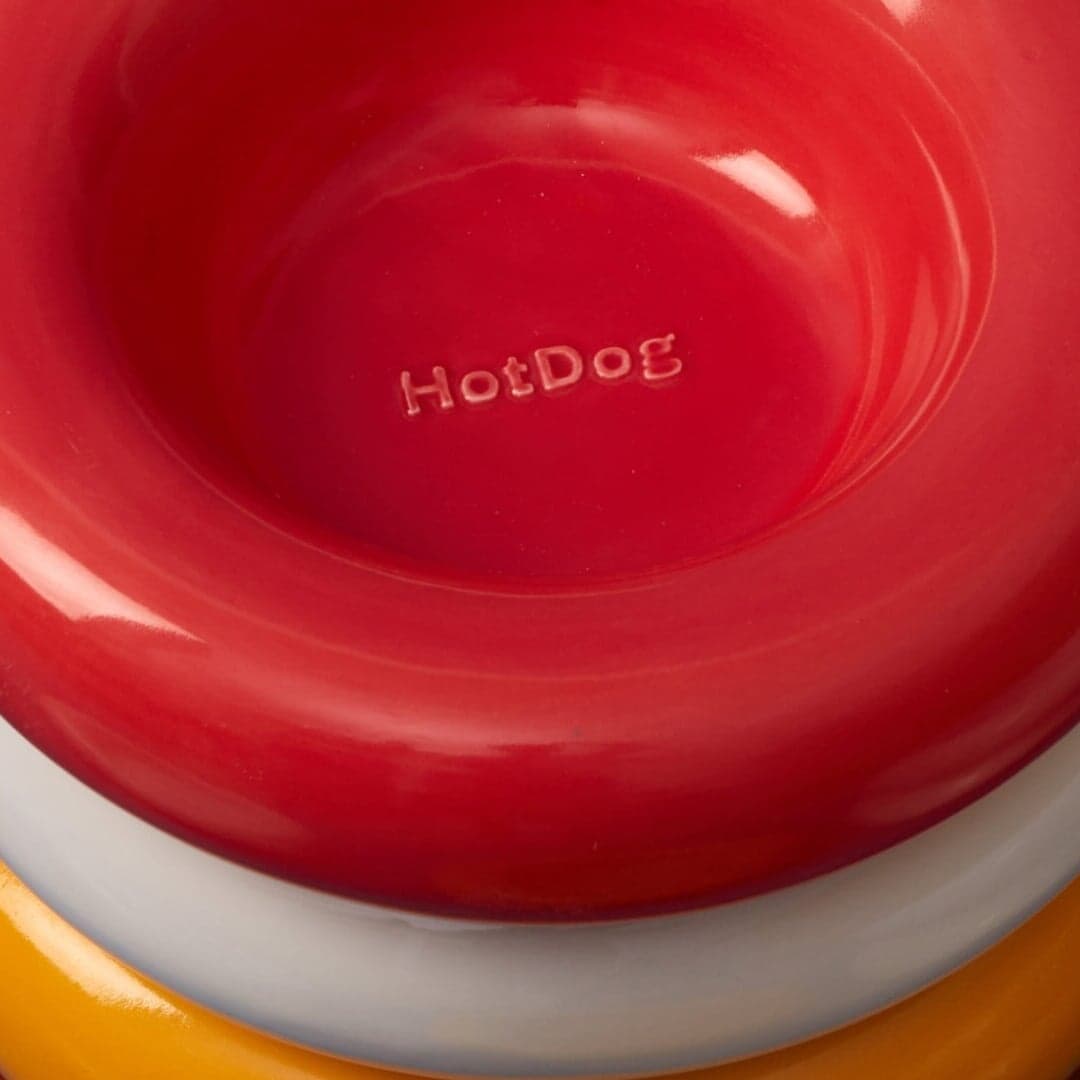
BP&O features SMLXL’s packaging design for the collaborative ‘Midnight Hotdog dog fur mist’, a limited-edition product uniting the minimalist aesthetic of Midnight Cosmetics with the exuberant personality of petcare brand HotDog. The design uses hand-painted gouache dog illustrations to bring color and humor to Midnight’s restrained black-and-white packaging, achieving a playful yet sophisticated balance.
Vancouver-based studio Pendo rebranded Dickie’s Ginger to appeal to younger drinkers with a lively, festival-inspired identity. The new design centers on a playful ginger-root character, custom typography by Nathan Metzler, and a raw, DIY art direction that rejects over-curation. The result balances fun and sophistication, positioning Dickie’s Ginger as a modern, locally made beverage brand.
The article covers the 2026 identity refresh for POV Budapest, Hungary’s first design conference, created by CM.SUPPLY in collaboration with COMET. Building on previous years’ visual systems, the new identity introduces motion and behavioural elements inspired by Hungarian modernists, maintaining its bold red-orange palette and typographic foundation.
Tiquismiquis Club, a Malaga-based design studio, designed the 29th issue of Odda Magazine, a 700-page fashion and culture publication. Founders Roberto Espartero and Juan Martín developed a typographic and layout system that balanced rhythm, hierarchy, and experimentation. The project reflects the studio’s research-driven approach and Odda’s editorial ambition to merge visual coherence with expressive variation.
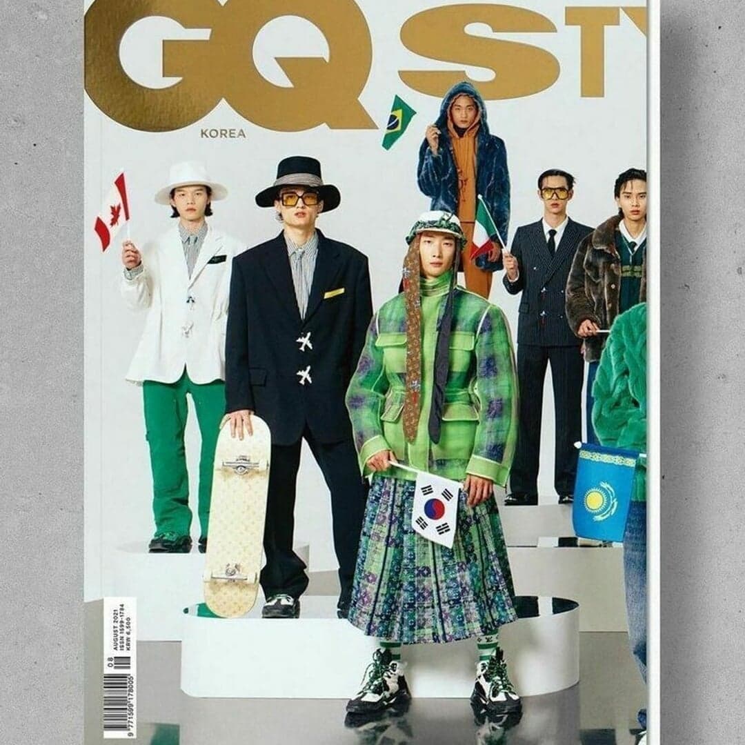
In this cultural column, Gary Grimes explores how major female pop stars are increasingly commissioning fine artists to create their album artwork, merging pop culture with high art. The article highlights collaborations such as Olivia Rodrigo with Chloe Wise, Lily Allen with Nieves González, and Katy Perry with Will Cotton, showing how these partnerships elevate pop musicians’ cultural prestige. Grimes argues that these crossovers reflect a growing desire among pop icons to be seen as part of the fine art canon.
Photographer and filmmaker Da’Shaunae Marisa spoke at Nicer Tuesdays LA about her creative journey, exploring themes of grief, heritage, and the beauty of Black life in America. The talk traced her evolution from early photography interests to impactful photojournalism and installation work, including a large Rubik’s Cube piece symbolizing identity and healing.
It’s Nice That has opened applications for its Ones to Watch 2026 showcase, an annual platform highlighting emerging creative talent across disciplines like graphic design, illustration, photography, moving image, and art. The article encourages early-career creatives to apply and shares testimonials from past participants who gained exposure and career opportunities through the initiative.
The article profiles Georgia-based artist Sasha Yazov, who transforms screenshots from The Sims and other early 2000s video games into airbrushed paintings. His work explores digital nostalgia, the aesthetics of mid-poly 3D environments, and the emotional resonance of virtual worlds. Through airbrushing and stencilling, Yazov captures the surreal, ghostly qualities of forgotten gaming spaces.
Lucy Werner’s Creative Boom insight article from June 2026 explores the emerging creative trends observed at Cannes Lions 2026. It highlights a shift from mass reach to meaningful resonance, the rise of community-driven creators, and a renewed appreciation for analogue and tactile experiences. Voices from Pantone, Polaroid, and Future Gazers emphasize human connection, artisanal methods, and the growing importance of taste and trust in the creative economy.
Creative agency Happy Ending has launched 'It Cometh Home', a self-promotional World Cup campaign that transforms England fans' prayer-like gestures into physical prayer beads. The limited-edition objects blend religious iconography with football culture, encouraging fans to participate in a treasure hunt rather than purchase them outright. The project highlights how meaningful design can transcend traditional advertising by tapping into shared rituals and emotions.
Creative Boom’s interview with brand designer Gavin Brophy explores the often-overlooked 'messy middle' of creative careers — the uncertain period between junior and senior roles. Brophy reflects on his journey from South Africa to the UK, his experiences at Trek Bicycle and EF Pro Cycling, and the emotional challenges of freelancing and self-doubt. The piece encourages open discussion about mid-career struggles and redefines success beyond job titles.
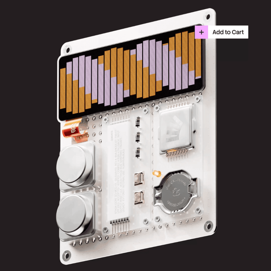
Koto has rebranded Stack Overflow to emphasize the enduring value of its developer community in an AI-dominated era. The new identity, centered on the concept of 'always in build,' uses modular design, a custom typeface, and a generative tool built with Claude to reflect the platform’s collaborative spirit. The rebrand was publicly tested and launched at major tech events, positioning Stack Overflow as a trusted source of human-verified knowledge.