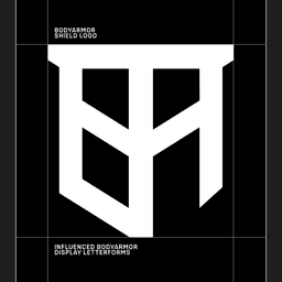
Studio DRAMA is a London-based type-focused design studio that designs typefaces sharpening brand identities and scaling across systems. Its practice centres on custom typefaces, logo refinement, animation and creative direction, treating typography as a business tool as much as a visual asset. Work includes custom type and logo refinement for Firefox and Mozilla, Warburtons, Snickers, Heinz, BODYARMOR, New Balance, Avanti West Coast, BBH, RSPCA, D&AD and Vogue Brasil. Recent recognition includes Bronze at Cannes Lions and at the Creative Circle Awards.
Technologies detected on Drama's website.
UnderConsideration’s Brand New reviewed the new logo, identity, and packaging for Warburtons, created by Taxi Studio in collaboration with Studio DRAMA. The rebrand refines the iconic orange look and introduces proprietary typography to modernize the UK bakery brand while maintaining its heritage.
Creative Boom reports on Taxi Studio’s comprehensive rebrand for Warburtons, celebrating the bakery’s 150th anniversary. The Bristol-based studio introduced a cohesive packaging system centered on the brand’s signature 'Baked Orange' color, a refined wordmark, and a bespoke type family by Studio DRAMA. The redesign emphasizes warmth, heritage, and visibility across Warburtons’ extensive product range.
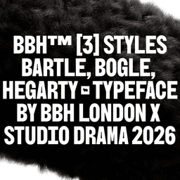
BBH has unveiled its first rebrand in 44 years, collaborating with Studio Drama to create a new visual identity centered around bespoke typefaces and 'zag' glyphs that reflect the agency’s ethos. The project includes motion design, 3D assets, and open-source typography that embody BBH’s heritage and forward-thinking spirit. The rebrand celebrates the agency’s founders while inviting others to 'zag' alongside them.
The article by Tom May explores whether creative agencies are facing a hidden productivity crisis. Through insights from multiple studio founders and creative directors, it examines how hybrid work, rising complexity, and economic pressures have reshaped agency operations since 2020. The piece calls for an honest industry-wide discussion about evolving business models and expectations.
Creative Boom’s article, written by Abbey Bamford, explores the growing importance of custom typography in brand identity, featuring insights from Studio DRAMA’s business director Frankie Guzi. It highlights how bespoke typefaces have evolved from luxury items to strategic assets, with examples from brands like Heinz, Mozilla, and RSPCA. The piece debunks myths around cost and complexity, positioning custom type as both a creative and financial investment for modern brands.
Jones Knowles Ritchie (JKR) has created a new identity and campaign for D&AD under the theme 'Drawn to Create'. The rebrand celebrates creativity as a magnetic force, featuring a custom typeface called Pencil Gothic developed with Studio DRAMA. The identity was brought to life at the D&AD Festival in London through immersive installations, motion design, and interactive experiences.
BP&O’s feature by Emily Gosling reviews JKR’s comprehensive rebrand for the RSPCA, marking the charity’s 200th anniversary. The new identity introduces a custom typeface, vibrant color palette, and modern iconography while retaining the recognizable blue. The project balances heritage with contemporary appeal, aiming to strengthen the charity’s relevance and financial sustainability.
The interview with Studio DRAMA’s co-founders William Richardson and Chris Nott explores their evolution into a brand-first type foundry. They discuss their collaboration with JKR on the RSPCA rebrand, resulting in the custom typeface Wilberforce Sans, and their philosophy of integrating branding strategy with type design. The article highlights their research-driven process, collaborative ethos, and growing recognition in the design industry.
The article by Poppy Thaxter highlights six charming brand identities created for pet-focused companies, showcasing how studios like Mythology, Never Now, and Brand Brothers bring personality and warmth to the pet industry. It celebrates the growing cultural importance of pets and the creative branding that reflects owners’ affection and devotion.
The Brand Identity’s 'The Edit' highlights five recent design projects, including DesignStudio’s rebrand for Center Parcs Europe, Studio DRAMA’s packaging for SAWAI rum, Standard Projects’ identity for Programa, Anne-Dorothée Schulz’s work for textile artist Solenne Jolivet, and ESH Gruppa’s branding for NIMA museum. The feature showcases diverse approaches to identity design, from illustrative and tactile to typographic and minimal.
PRINT Magazine covers JKR’s global refresh for KFC, which centers the brand’s iconic bucket as the creative foundation for a unified visual identity. The redesign strengthens existing brand elements, introduces bold typography, and extends across packaging, digital, and restaurant experiences. The project reflects KFC’s push toward immersive, experience-driven dining environments.