An uncompromisingly bold display sans spanning ultra-condensed to wide — built for headlines and nothing else. View at Commercial Type →
Used by Ony (5), Pentagram (3), Seachange, Aline, Alter
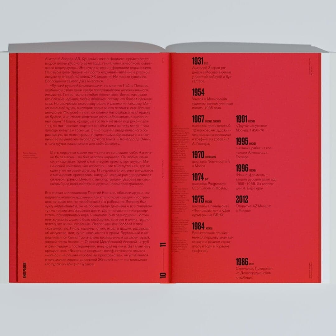
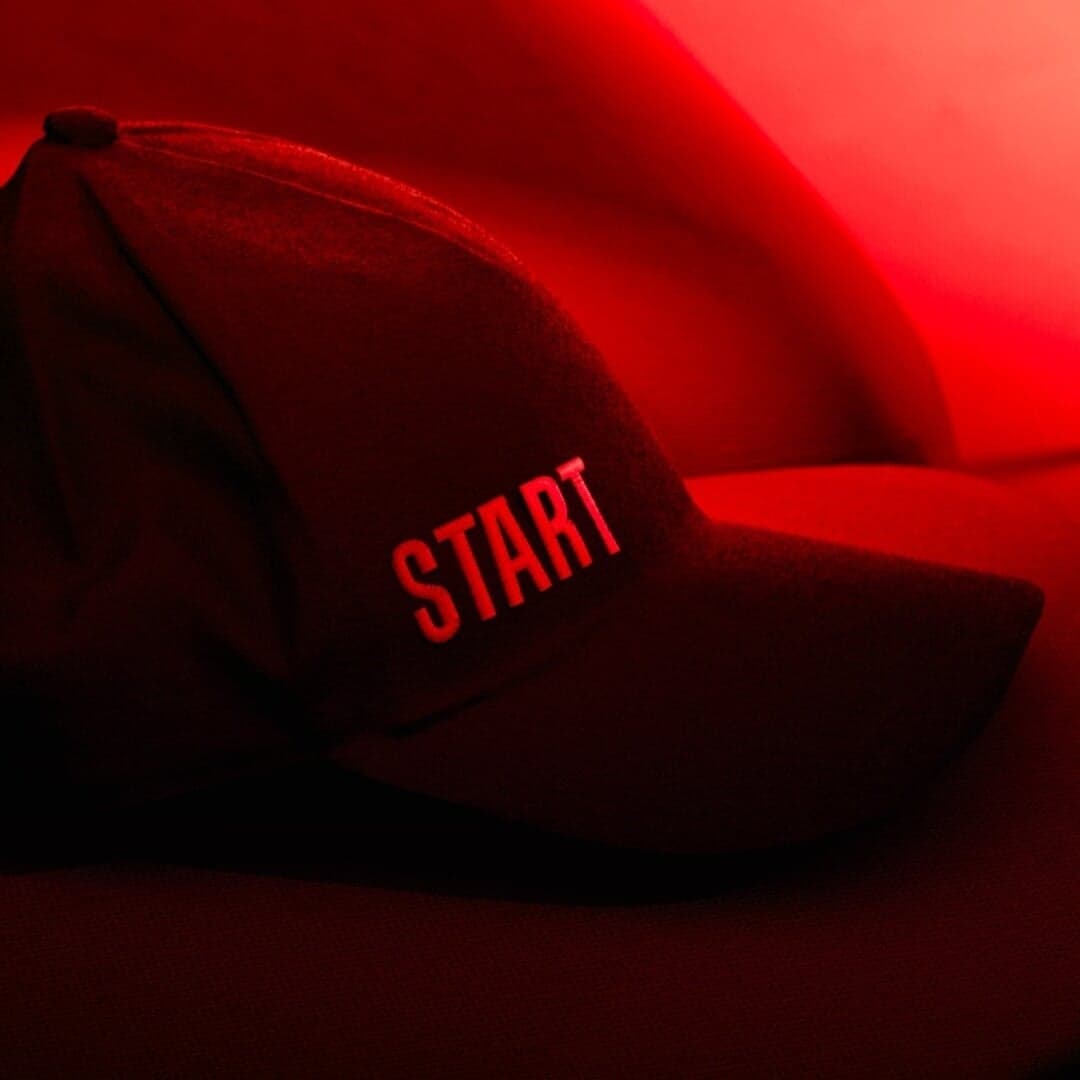
Set for Bank Otkritie, Flacon, Flacon Magazine, Museum AZ, NYU Skirball Center, Princeton University Press, Snog Productions, START, Supertrash, Tribeca Festival
Cases set in Druk, as credited by the studios in their own writeups.
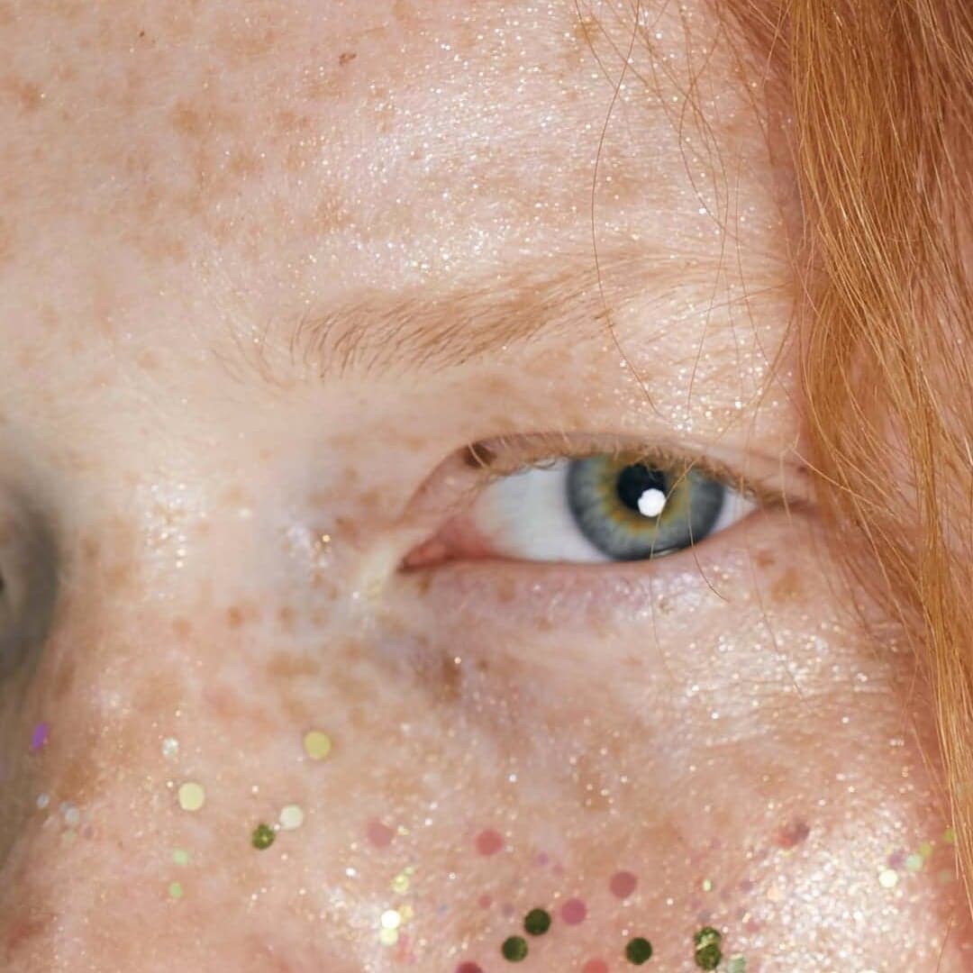
A LINE created a bold and playful new identity for Los Angeles-based Snog Productions, drawing on the British slang meaning of 'snog' to craft a typographic wordmark using Druk. The design uses a vibrant red 'O' to evoke lips and passion, complemented by GT Zirkon for functional typography across print and digital applications.
The Brand Identity’s 'The Edit' highlights five new design projects from around the world, including Studio Work’s identity for Shikoba Therapies and other works by STUDIO DOUBLE, & SMITH, Twoo, and Studio Mistaker. Each project showcases distinctive typographic and conceptual approaches across wellness, arts, food, property, and photography sectors. The feature emphasizes thoughtful design, sustainability, and typographic experimentation.
The Brand Identity’s 'The Edit' roundup showcases five new design projects from studios including Mean, The Refreshment Club, Fook, Bruno Arizio’s team, and M M NT. Featured work spans branding and packaging for honey, canned cocktails, cannabis, and media companies, highlighting creative uses of typography, illustration, and material craft. The article celebrates bold, minimal, and conceptually rich design approaches across global studios.