Brand Identity For Rugiet
Phallic branding? Pentagram made that the point.
Pentagram developed a brand strategy and visual identity for Rugiet, a leader in men’s health. The design emphasizes focus and control through a clean, vertical logo, a custom typeface, and a bold orange palette that distinguishes the brand from typical wellness aesthetics.
Set in Rugiet Tall
Insights
- Pentagram’s core move was to make Rugiet feel more direct and assertive than the typical pastel men’s-health category, balancing “clinical credibility” with a bolder voice.
- The first thing you notice is the vertical stacked logo: Pentagram says it has “a resolute sense of control,” and BP&O notes it reads as both an ED joke and a growth signal.
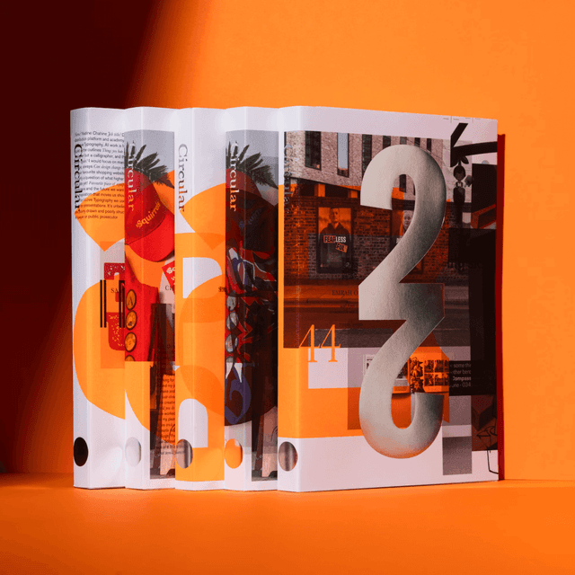
- Rugiet Orange is intentionally anti-wellness: Pentagram describes it as “a vivid, intense hue” that breaks from the pastel palette common in the category.
- The custom typeface, Rugiet Tall, was developed with Commercial Type to mirror the logo’s vertical proportions and work especially well in upright compositions and vertical headlines.
- The project was led by Pentagram partner Matt Willey in New York, with Jonny Sikov, August Dine, and Malithi Gunawardena on the team, while Alright Studio handled the website.
- Pentagram, Alright Studio Rebrand Men’s Health Platform Rugiet — the-brandidentity.com
1 / 2Swipe
Keep exploring
Related cases