← Back to Foundries
Weltkern — 13 cases
Lausanne foundry and design shop, home of the TWK library. Visit Weltkern →
Weltkern typefaces credited by studios in their case writeups.
Weltkern typefaces in the news
- Fable&Co. Builds Nova Biochem’s First Brand Identity
The Brand Identity · Jun 25, 2026
Fable&Co. developed the first full brand identity for biotech startup Nova Biochem, a company transforming lignin waste into circular chemicals. The identity centers on the concept of 'Matter,' expressed through a molecular-inspired symbol, a restrained monochrome palette accented by Catalyst Yellow, and cohesive imagery linking organic and engineered materials. The rebrand positions Nova Biochem as a credible, confident industrial player ready for investors and partners.
Fable&Co.Nova Biochembranding - Holographik reshapes Sui brand beyond the “DeFi casino” look
The Brand Identity · Jun 15, 2026
Holographik collaborated with the Sui Foundation to evolve the Sui brand, refining its identity to move away from the typical 'DeFi casino' aesthetic. The refreshed system retains the droplet logo, introduces a refined blue palette, and employs TWK Everett as the sole typeface. The result is a cohesive, trustworthy visual language that supports Sui’s growth as a blockchain infrastructure brand.
HolographikSui FoundationSuibranding - Fable&Co. rebrands TQA for an AI space still writing its own rules
The Brand Identity · Mar 26, 2026
Fable&Co. has rebranded TQA, an AI and automation consultancy, to better reflect its evolution into an agentic AI authority. The new identity uses dark, atmospheric foundations with luminous gradients and glass morphism to convey intelligence and adaptability. The rebrand includes a full strategic and visual overhaul, anchored by the TWK Everett typeface and a modular grid system designed for scalability.
Fable&Co.TQAbranding - Bielke&Yang Turns 25-Year Sketch into Jewel Display System
The Brand Identity · Oct 2, 2025
Bielke&Yang developed the brand identity for Jewel, a Norwegian-made display system that celebrates the artistry of CD covers. The project, initiated by designer Marius Brandl after 25 years of development, combines nostalgic references to 90s music culture with precise, engineered design. The identity features a custom grid-based typeface, local material sourcing, and a campaign created with Bow and CGI artist Rayan Zomorodi.
Bielke&YangBowJewelbranding - Signifly Redefines Rennsport Identity Inspired by Porsche 911 Artistry
The Brand Identity · Sep 3, 2025
Signifly’s London team rebranded Porsche 911 specialist Rennsport with a new identity inspired by 1980s and 90s automotive design. The project balanced heritage, craftsmanship, and performance through refined typography, adaptable colour systems, and versatile applications across digital and physical touchpoints. The rebrand debuted successfully at Goodwood Revival, earning strong engagement and positive reception.
SigniflyRennsportbranding - Lucky Dip Revamps Relesys Identity to Empower Workforce
Creative Boom · Mar 26, 2025
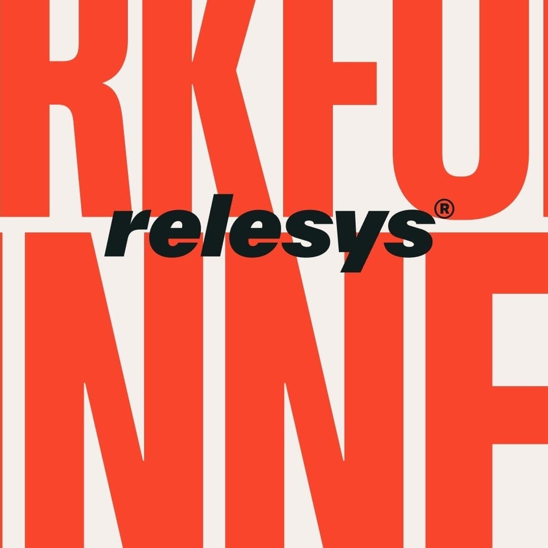
Creative studio Lucky Dip has rebranded employee engagement platform Relesys with a bold, sports-inspired identity centered around a podium motif and a punchy red palette. The rebrand shifts focus from technology to people, using custom typography, hand-drawn illustrations, and a motivational tone to position Relesys as 'The Motivator' in its industry. The new system includes a website, digital toolkit, and flexible brand assets that empower the internal team to champion the brand.