← Back to Foundries
Klim Type Foundry — 52 cases
Kris Sowersby’s independent foundry in Wellington, New Zealand. Visit Klim Type Foundry →
Klim Type Foundry typefaces credited by studios in their case writeups.
Kris Sowersby’s independent foundry in Wellington, New Zealand. Visit Klim Type Foundry →
Klim Type Foundry typefaces credited by studios in their case writeups.
DIOME has refined its supplement packaging system under the direction of Victoire Colliou, introducing a richer brown palette and a more structured, minimalist design. The update unifies the brand’s two products, Rested and Grounded, through consistent typography and restrained visual language. The redesign reflects DIOME’s science-led yet lifestyle-conscious positioning, evolving from its earlier collaboration with ACNE Art Department.
The Brand Identity’s feature, presented by Frontify, explores BUCK’s 10-week collaboration with Eventbrite to reimagine the event platform’s brand identity. The rebrand, centered on the concept of connection and discovery, introduced a new logo system called 'The Path,' expressive motion and illustration systems, and a refreshed color and type framework. The partnership emphasized in-person collaboration and emotional storytelling to reinvigorate Eventbrite’s perception beyond ticketing.
Clay Global developed the brand identity and app experience for Eden, an AI-powered real estate platform that translates users’ feelings and visual preferences into personalized property recommendations. The design combines classical and contemporary aesthetics, balancing emotional warmth with digital clarity. Through thoughtful typography, illustration, and interaction design, the brand aims to make home searching more intuitive and human-centered.
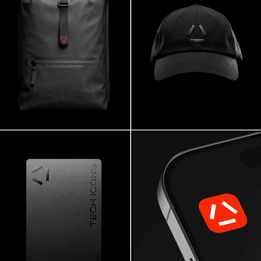
Montreal-based studio Caserne designed the brand identity for Tech Icons, a London-based intelligence platform, treating it more like a gallery than a typical tech media site. The minimalist system uses white as a structural foundation, restrained red accents, and editorial typography to convey clarity and trust. The design balances aesthetic restraint with functional clarity for a busy professional audience.