Brand Identity For Imperial College London
Imperial dropped “College London” — and students pushed back.
Pentagram developed a new brand identity for Imperial College London, introducing 'Imperial' as the official visual shorthand to align with other leading global universities. The refreshed identity features a bespoke wordmark, custom typeface, and the signature 'Imperial Blue', presenting the institution as modern, open, and forward-looking while honoring its scientific heritage.
Set in Imperial Sans, Imperial Sans Display, Imperial Slab
Insights- Imperial’s main move was using “Imperial” as the official visual shorthand, while keeping the full legal name, Imperial College London, unchanged; Pentagram said this aligns the university with Oxford, Cambridge, Harvard and Stanford.
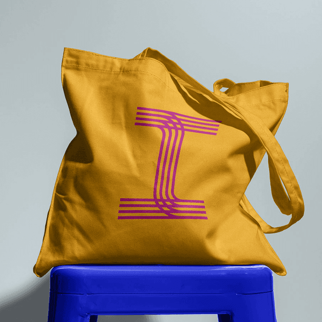
- The core logo idea is deliberately subtle: a bespoke wordmark where only the “I” is serifed inside an otherwise sans-serif setting, and that “I” becomes a recurring visual device across the broader system.
- The identity system includes Imperial Blue, black and white, plus a custom type family by NaN’s Luke Prowse: Imperial Sans, Imperial Sans Display, and Imperial Slab for titles and headlines.
- The refresh was meant to solve a dated 1990s identity that the university said had become disjointed and weakened student recruitment, fundraising, and outreach for a top-ten global science-focused institution.
- Reaction focused less on the type system and more on the name and wordmark: a Change.org petition by Anaya Jaffer quickly gathered signatures, the UCU raised both historical-connotation and accessibility concerns, and Felix later reported the total refresh cost at £434,801.47, including strategy, accessibility work, signage, animation, and promotional items.