Editorial Design For Giuseppe Penone Exhibition Catalogue
Why a gold edge is part of the artwork, not decoration.
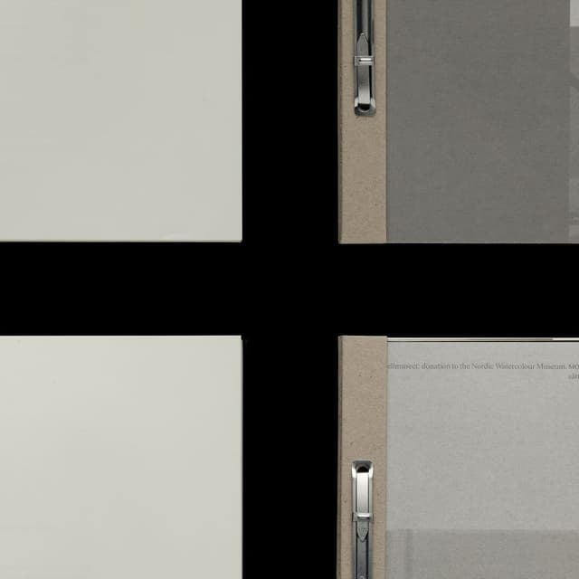
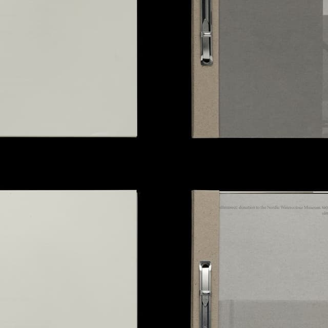
Atelier Dyakova designed a catalogue accompanying Giuseppe Penone’s exhibition at Serpentine South, showcasing five decades of his work. The publication reflects Penone’s exploration of nature and material through tactile design elements such as vellum interleaves, embossed details, and gold-foil edges.
Set in Modulo
Insights
- Atelier Dyakova’s main move was to make the catalogue behave like Penone’s work: tactile, minimalist, and material-led, using vellum interleaves, embossed details, and a gloss gold-foil edge to echo the artist’s focus on nature, time, and what lies beneath the surface.
- The strongest design decision was typography: instead of commissioning a new face, the studio chose Modulo from the historic Turin foundry Nebiolo, digitised by Archivio Tipografico in 2022, because its heavy, sculptural, almost carved forms connect to Penone’s Turinese heritage and Arte Povera.
- The book is a 168-page hardcover with one insert, sized 306 × 220 mm and published in June 2025 for the Serpentine South exhibition running 3 April–7 September 2025; it was co-published by Serpentine and Walther König and edited by Claude Adjil and Alexa Chow.
- The cover reproduces Albero folgorato (Thunderstruck Tree), 2012, and uses three-dimensional foiling and embossing to translate the sculpture’s surface into print, while the gold-foil edge references the gold leaf that reveals the tree’s hidden interior.
- The catalogue also includes new writings and drawings by Penone, an extended conversation with Hans Ulrich Obrist, and contributions from Federico Campagna, Ludovico Einaudi, Precious Okoyomon, and Elif Shafak.
Keep exploring
Related cases