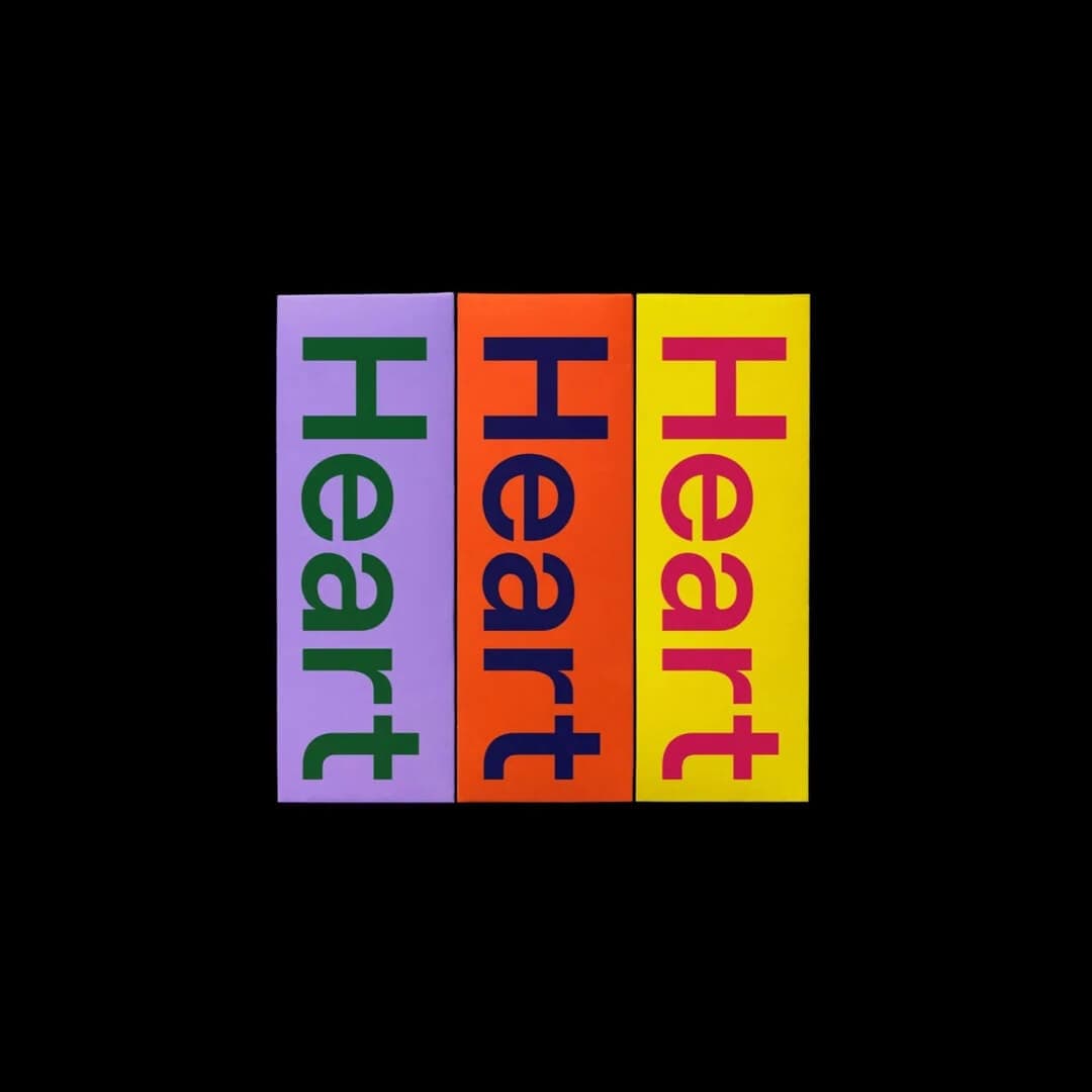
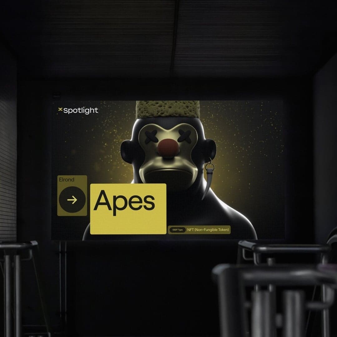
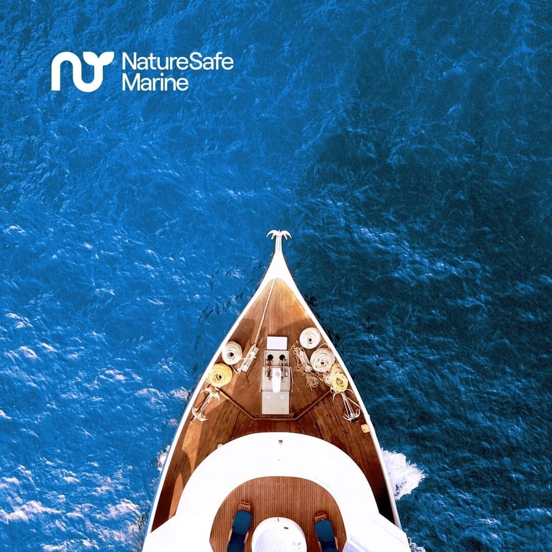


A mono-linear geometric sans with clean terminals and smooth stem connections, grown out of Moderat. View at Displaay →
Used by Motto, Vanderbrand, Bürocratik, Size, Clay, Order Design
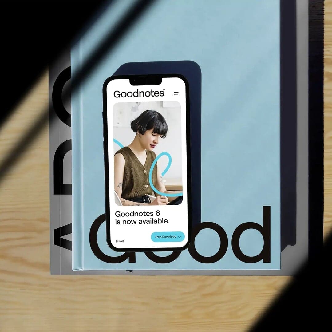
Set for Castley McCrimmon, Goodnotes, Loah Beer Co., MultiversX, NatureSafe, Orlando Corporation, Streetbeat, Teal, Tines, Twitch
Cases set in Roobert, as credited by the studios in their own writeups.
The Brand Identity’s article by Poppy Thaxter highlights five standout sans serif typefaces—Neue Montreal, ABC Favorit, Aeonik, Roobert, and GT America—showcasing how they’ve been used across various branding projects. The piece references multiple studios and designers who have applied these fonts in identities spanning fitness, real estate, fashion, and technology sectors. It celebrates the versatility and enduring appeal of sans serif typography in modern brand design.
BP&O features Collins’ rebrand of Canadian paper mill Rolland into Sustana, repositioning it as a leader in 'clean materials' rather than traditional paper manufacturing. The project includes a new name, logo, custom typeface by Sharp Type, and motion identity that emphasize sustainability and innovation. While the article praises the clarity and design execution, it questions the renaming’s potential overemphasis on eco-branding.
The Brand Identity features Maven Creative’s brand identity for Breaking, a plastic degradation company born from Colossal Biosciences. The identity channels the energy of its breakthrough enzyme Microbe X-32™ through pixelated visuals, bold typography, and motion design. Collaborations with Buff Motion and 3D artist Vincent Schwenk helped bring the brand’s optimistic and disruptive spirit to life.
SEESAW features the website for Suno, an AI-powered music creation platform that aims to make music-making accessible to everyone. The showcase highlights the site’s design and typography choices, using Libre Caslon Condensed and Roobert.