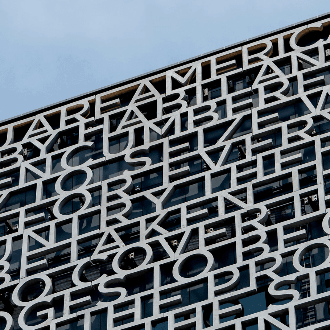

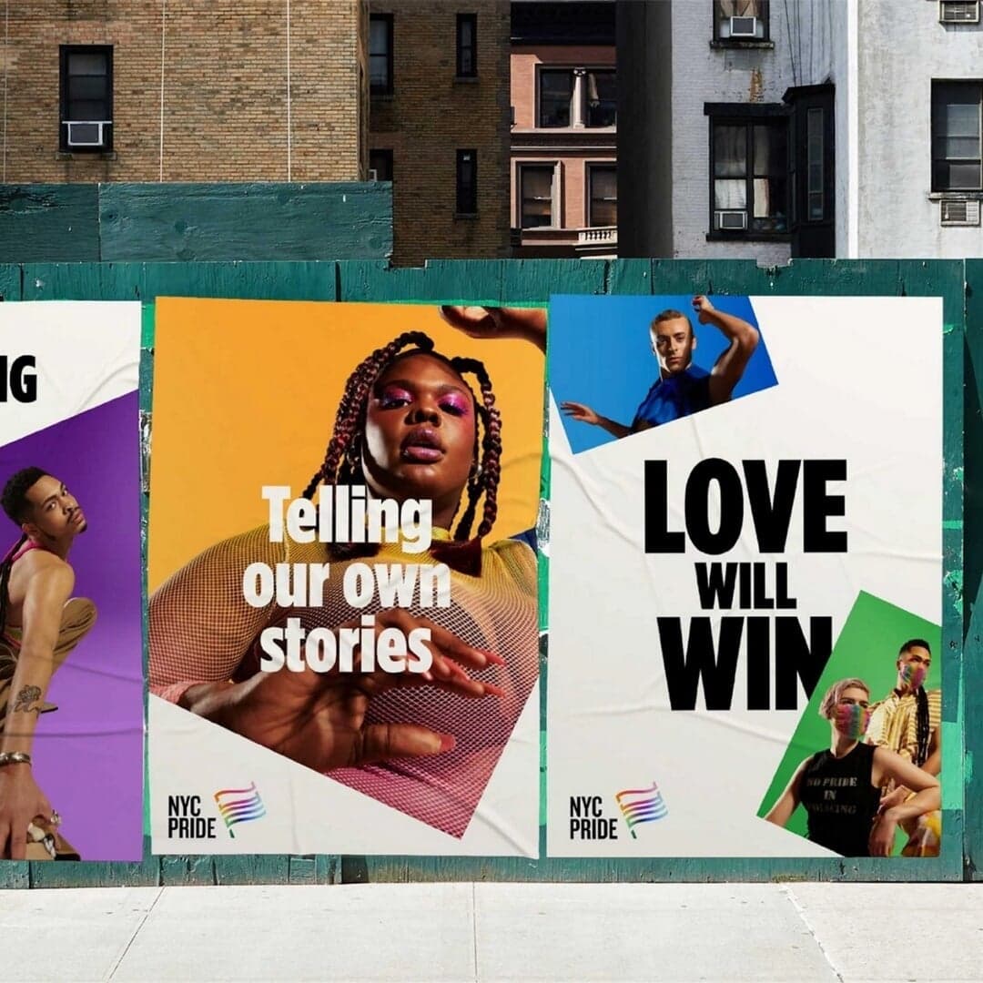
A geometric sans drawn from New York’s vernacular building lettering; later the typeface of the Obama 2008 campaign. View at Hoefler&Co →
Used by Pentagram (2), Anagrama (2), Stink, Lippincott
Set for Habibis, Heritage of Pride, Hyperscience, Sphynx, The Obama Foundation, Woodbury Corporation
Cases set in Gotham, as credited by the studios in their own writeups.
Typographic Installation For The Obama Presidential Center
Eurovision has unveiled a refreshed global identity for its 70th anniversary, designed by Amy Bedford of Sheffield-based one-woman studio PALS. The rebrand introduces a new logo, typeface, and flexible digital system that modernises the contest’s visual identity while retaining its iconic heart symbol. The project highlights a shift toward agile, independent creative models outside major capitals.
Manual has rebranded the Obama Foundation, evolving its visual identity rooted in the iconic Obama campaign logo. The San Francisco and Amsterdam-based studio expanded the Gotham type family with Monotype’s Sara Soskolne and introduced a motion-led system and refreshed color palette. The rebrand unifies the foundation’s programs and channels while maintaining its legacy of optimism and community focus.
The Brand Identity interviews Spanish designer Xavi Martínez about his approach to branding and editorial design. He discusses his experiences at studios like Bunch, ruiz+company, and Artofmany, and details his conceptual process behind projects such as Insite Food and El Imparcial. Martínez emphasizes research, collaboration, and conceptual clarity as key to his creative process.