Visual Identity And Packaging For A Specialty Coffee Roastery
A coffee pack built to survive constant menu churn.
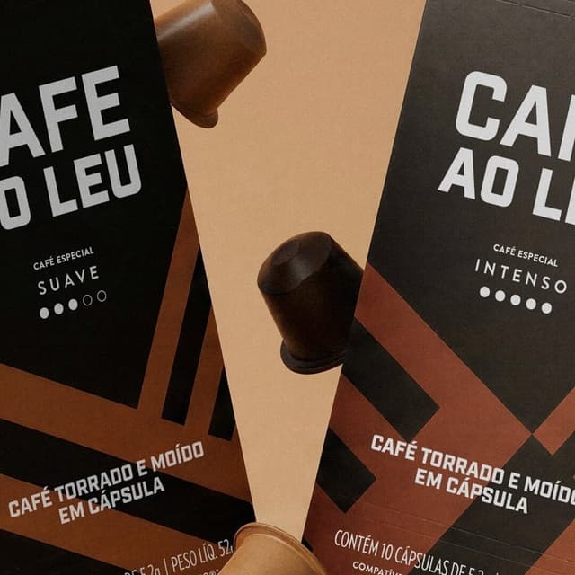
Céu Design developed a new identity and packaging system for Cafe Ao Leu, a renowned specialty coffee roastery from Rio de Janeiro. Drawing inspiration from the café’s striped awning, the design transforms a familiar local element into a modular graphic system that balances sophistication and flexibility across products.
Insights
- The main challenge was inventory, not aesthetics: Cafe Ao Leu kept rotating coffee lots, with 15+ coffees plus capsules and microlots, so Céu Design built a system for unity, recognition, and flexibility instead of a fixed pack design.
- The identity starts from the shop’s striped awning, described by the studio as “a simple symbol, loaded with memory,” then gets abstracted into modular black-and-white graphic patterns that can flex across changing products.
- On-pack, the system separates constant and variable elements: striped brand patterns create consistency, while solid backgrounds, spot colors, and colored labels change to identify each coffee batch.
- Cafe Ao Leu is a Rio de Janeiro specialty coffee reference founded by barista Leonardo Gonçalves, and the new identity supports a roastery that advertises weekly fresh roasts and a fast-changing lineup.
- The studio lists the work as a Latin American Design Awards 2025 Bronze in Packaging / Beverages, with creative direction by Vítor Scarpato and Glauber Vilvert.
1 / 9Swipe
Keep exploring
Related cases