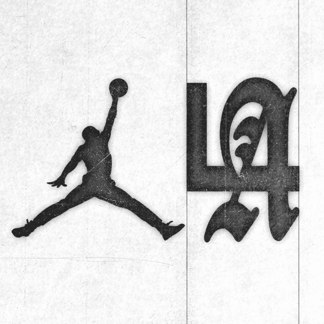
Visual Identity For Jordan Brand
Jordan didn’t need a new logo—just a new typographic language.
WØRKS collaborated with Jordan Brand to create a future-facing visual identity system that honors the brand’s legacy while evolving it for a new cultural era. The work centered on a bespoke typographic suite and supporting graphic devices inspired by Jordan’s history, materials, and lifestyle influences. The system was designed to extend seamlessly across apparel, footwear, packaging, campaigns, and digital experiences.
Insights
- The studio’s brief was deliberately narrow: WØRKS wasn’t redesigning the Jumpman, but building a typographic language for 2026 that could honor Jordan’s legacy while moving it into a new cultural era.
- The system centers on five bespoke typographic marks: Air, Flight, Jordan, 23, and Streetwear. Each was drawn as a custom lockup, not simply typeset.
- The research pulled from specific Jordan references beyond basketball: 1990s visual language, the typography of the Air Jordan 14, sneaker detailing, and Michael Jordan’s eyewear, cars, and watch collection.
- A standout move was turning MJ’s eyewear into oval-frame graphic devices, supported by motorsport-influenced forms and compressed silhouettes, giving the system reusable containers that feel adjacent to Jordan without relying on sports iconography.
- WØRKS describes the letterforms as having extended proportions, uniform heights, subtle irregularities, and precise cuts, designed to work across apparel, footwear, trims, packaging, campaigns, retail, and digital experiences while feeling “sharp, refined, and unmistakably Jordan.”
Keep exploring
Related cases