Brand Refresh For A Local Electric Shuttle Network
Eight million rides, but it still looked like a pilot program.
The Collected Works repositioned Circuit, a free all-electric shuttle service, from a small-scale pilot impression into a flexible brand built for expansion across multiple cities. The studio developed strategy, a full visual system, and brand language that could feel locally rooted whether Circuit appeared in a beach town or a downtown grid. At the center of the system is a continuous line motif inspired by transit routes, used to represent connections between stops, riders, and neighborhoods. The Collected Works also designed vehicle wraps as moving brand assets, supported by a vivid color palette and distinctive typography that improve visibility, warmth, and recognition on the street.
Insights
- The main challenge was perception, not function: after 8 million rides across 40+ locations, Circuit had outgrown a “pilot program” look and needed to feel like a national network.
- The Collected Works built the identity around “a continuous line that moves, turns, loops, and explores,” using a generative tool so the route pattern could flex across website, billboards, and different city contexts.
- Vehicle wraps were treated as the brand’s “biggest, most visible touchpoint” — essentially “a billboard on wheels” — designed to be readable from the street while still rewarding close-up viewing.
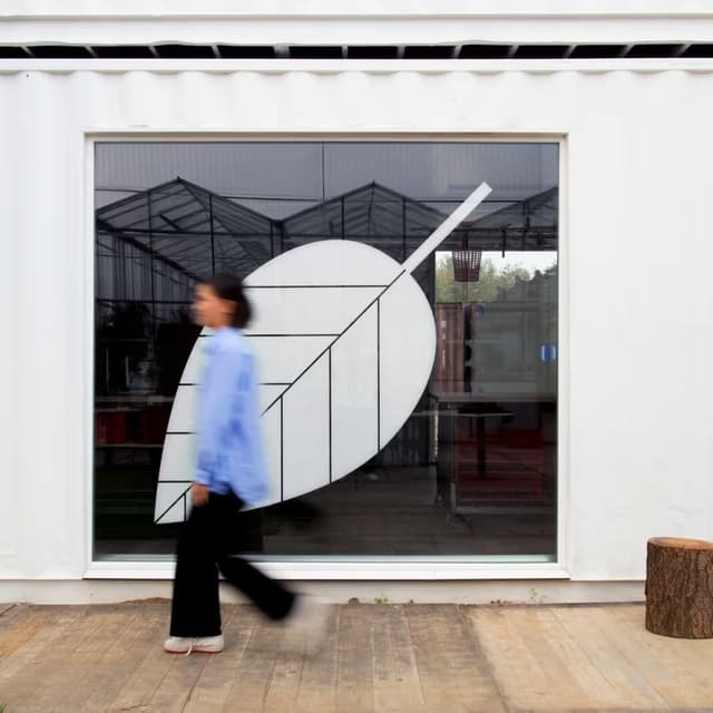
- The system was built to stay consistent and locally rooted at once, with one promise across every market — "a clean, friendly, genuinely local way to get around" — supported by minimal graphic frames drawn from road-signage silhouettes.
- Circuit’s business model adds a layer of strategy to the design: the service is supported by partners and advertisers to provide low-cost or free rides, so the fleet graphics also function as a revenue-facing brand surface.
1 / 5Swipe
Keep exploring
Related cases