Brand Refresh For A Specialty Coffee Pioneer
The real story is hidden in the gradients and flavor palette.
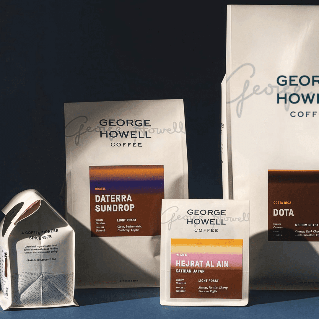
Proportion partnered with George Howell Coffee to evolve its brand while honoring a pioneering legacy in specialty coffee. The work brings greater clarity, warmth, and accessibility to a name synonymous with excellence. A hand-drawn icon reconnects the brand to farms, craft, and the many hands behind every cup. A new flavor palette system makes tasting notes intuitive, visualizes complexity, and helps customers confidently find their perfect cup. Together, these elements reintroduce the brand’s heritage of flavor in a contemporary, human way, aligning the story, visuals, and product navigation. The result is a clear, inviting system that respects decades of uncompromising standards and deep relationships with farmers while guiding customers through offerings with ease.
- Proportion refreshed George Howell Coffee’s brand identity with a clear constraint: preserve the legacy of George Howell as a pioneer in specialty coffee while updating how the brand shows up today.
- The centerpiece move is a new hand-drawn icon—intentionally imperfect—to inject warmth and a handcrafted feel, contrasting the “refined” positioning without becoming sterile.
- A color-coded flavor palette system was introduced to add clarity and accessibility across the brand experience, helping customers navigate offerings through a consistent visual language.
- The identity balances “heritage” and “organic” cues with modern structure, using gradients and a curated palette to make the system feel contemporary while still human.
- Overall, the redesign focuses less on a logo swap and more on an experience framework: icon + palette + gradients working together to communicate flavor, quality, and approachability in Food & Beverage.