Brand Development For Scorebuddycx
They didn’t change the logo—they changed the budget conversation.
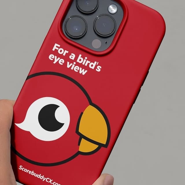
Piquant rebranded ScorebuddyCX, repositioning it from a quality assurance tool to an enterprise-level customer experience platform. The new identity introduced a digital-first system centered around a redesigned parrot mascot, a humanist typeface, and an accessible color palette to convey clarity, approachability, and scalability.
Insights
- Piquant’s main strategic move was repositioning Scorebuddy from a quality-assurance tool into an enterprise customer experience platform, because QA is seen as overhead while CX sits in the enterprise budget column.
- The rename from Scorebuddy to ScorebuddyCX is doing strategic work in just two letters, and the brand line argues the shift is bigger than visuals: “A rebrand that only changes how a company looks misses the point.”
- Buddy the parrot was rebuilt from a single static illustration into a flexible character system that celebrates wins, flags insights, and even looks embarrassed on error pages—making him the “most human touchpoint” in an enterprise system.
- The identity system is digital-first and accessibility-led, combining a humanist typeface, a WCAG-tested colour palette, and modular motion that “flexes and reconfigures like the platform itself.”
- The platform’s scale supports the repositioning: it serves more than 300 organisations across 25 countries, spanning voice, chat, and email, with QA scorecards, AI-powered scoring, conversation analytics, coaching, and integrated learning.