Brand Identity Redesign For Stack Overflow
AI scraped Stack Overflow, so Koto turned it into the answer engine.
Koto reimagined Stack Overflow’s brand for an AI-first world, repositioning it from a static knowledge base to a living hub of verified human expertise. The new identity, built around the idea 'Always in Build', introduced a simplified logo, custom typeface, generative visual system, and refreshed tone of voice that celebrates clarity, curiosity, and continuous evolution.
Set in Stack Sans
Insights- Koto’s main move was to answer AI disruption by reframing Stack Overflow as “the ultimate arbiter and hub of truth” rather than a static archive, with Cat Hill stressing that “speed is only useful if the knowledge underneath is trusted.”
- The brand platform, “Always in Build,” mirrors developer culture by treating the identity as iterative and unfinished; the visual system uses simplified building blocks, and Koto intentionally kept the toppling tower because a stack overflow is also an engineering failure.
- A custom typeface, Stack Sans, was created with a signature notch detail drawn from the building process; Stack Sans Headline was also released on Google Fonts, embedding the brand into developer culture instead of a closed guidelines system.
- Koto built a generative tool with Claude to produce large asset libraries without operational strain, and the logo geometry can unfold into reforming, reorganizing shapes for a flexible, modular system.
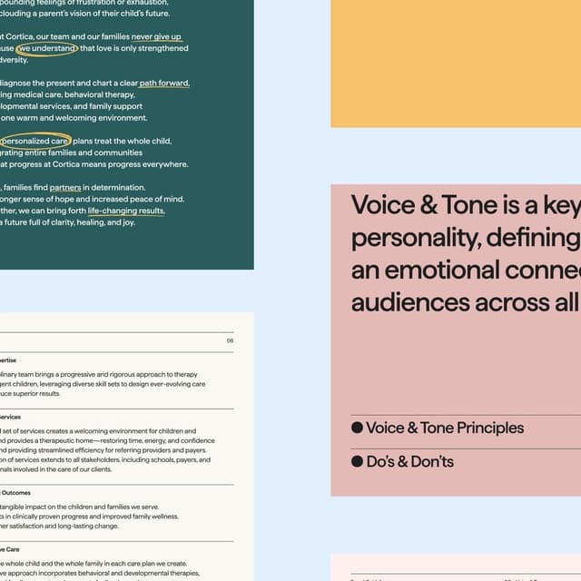
- The rollout was unusually public: design routes were shown at WeAreDevelopers World Congress 2025 and voted on by the community before the launch at Microsoft Ignite in November 2025; the tone of voice was defined as “simple, spirited, syntax,” balancing clarity with dry wit.
News