Hr Brand Identity For Tochka Bank
Why Tochka ditched its polished bank look for HR recruiting
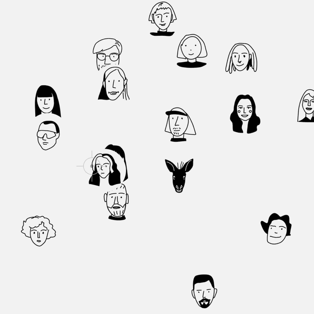
ESH gruppa developed a dedicated HR visual identity for Tochka Bank, distinguishing it from the main corporate brand. The system draws inspiration from living processes, using movement, layering, and imperfection to express the diversity of teams while maintaining cohesion through shared visual language and color accents.
Set in ABC Gravity Compressed, Tochka Script
Insights- The main problem was mismatch: Tochka's HR communications ran on the polished, product-led bank brand, which produced low CTR — and, as HR Brand Leader Ksenia Suvorova put it, "we saw and understood that we were being read differently from how we expected."
- ESH gruppa responded with a dedicated employer-brand system inspired by living processes: movement, layering, deliberate imperfection, repetition, overlap, crossed-out words, contrasting compositions, and expressive 3D illustration.
- The system separates HR from product with new light-blue accents and real employee photography, showing both people and the surrounding space to capture team atmosphere rather than stock portrait energy.
- A key design idea was adjustable “volume” by department: louder and more dynamic for IT and Sales, quieter and more restrained for Support and Legal, all within one shared visual language.
- Typography also bridges the new system and the parent brand: ABC Gravity Compressed was used for headlines, while Tochka Script—borrowed from the bank’s main corporate identity and based on an employee’s handwriting—appears as an outlined display element.