Brand Identity For Dunluce Lodge Hotel
16 elements. One crest hidden in plain sight.
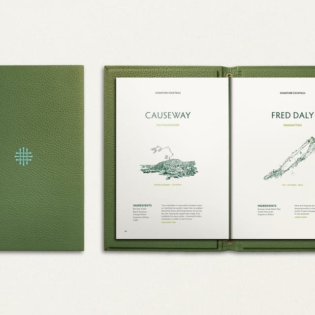
COLT created a luxury hotel brand identity for Dunluce Lodge on Northern Ireland's Causeway Coast. Rooted in the region's landscape, folklore, and heritage, the system combines an abstract Portrush-inspired symbol, refined Irish palette, linen-filtered wildflower photography, and hand-painted illustrations across hotel touchpoints and sub-brands.
Insights
- COLT's brief was to make Dunluce Lodge feel inseparable from the Causeway Coast, so the identity pulls from the region's landscape, spirit, and heritage rather than generic luxury cues.
- The main mark is an abstraction of the Portrush crest, built from 16 core elements, giving the hotel a symbol tied directly to its place beside Royal Portrush Golf Club.
- The system’s most distinctive visual device is the photography: regional wildflowers shot through linen create a soft, textile-diffused look, supported by hand-painted watercolour illustrations and fine finishing.
- The palette is intentionally restrained to evoke Ireland without relying on shamrock-green shorthand, reinforcing the lodge’s understated, refined positioning.
- The broader brand rollout went beyond a logo, including copywriting, full guidelines, print, advertising, social, e-shots, and three internal sub-brands for in-room chocolate, leather menu folders, and golf apparel; COLT also worked with its sister company Atalanta.
1 / 7Swipe
Keep exploring
Related cases