Frutiger’s rationally numbered neo-grotesque family — Helvetica’s systematic Swiss rival, released the same year. View at Deberny & Peignot / Monotype →
Used by Colt, Bontemps, Schick Toikka, Anagrama, Order Design, Play Studio
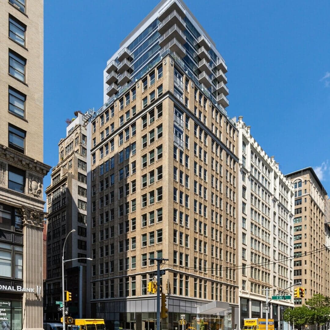
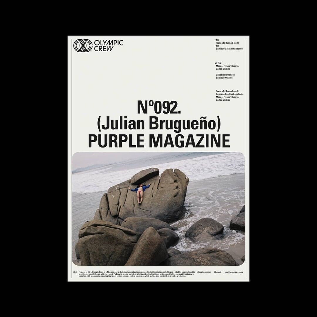
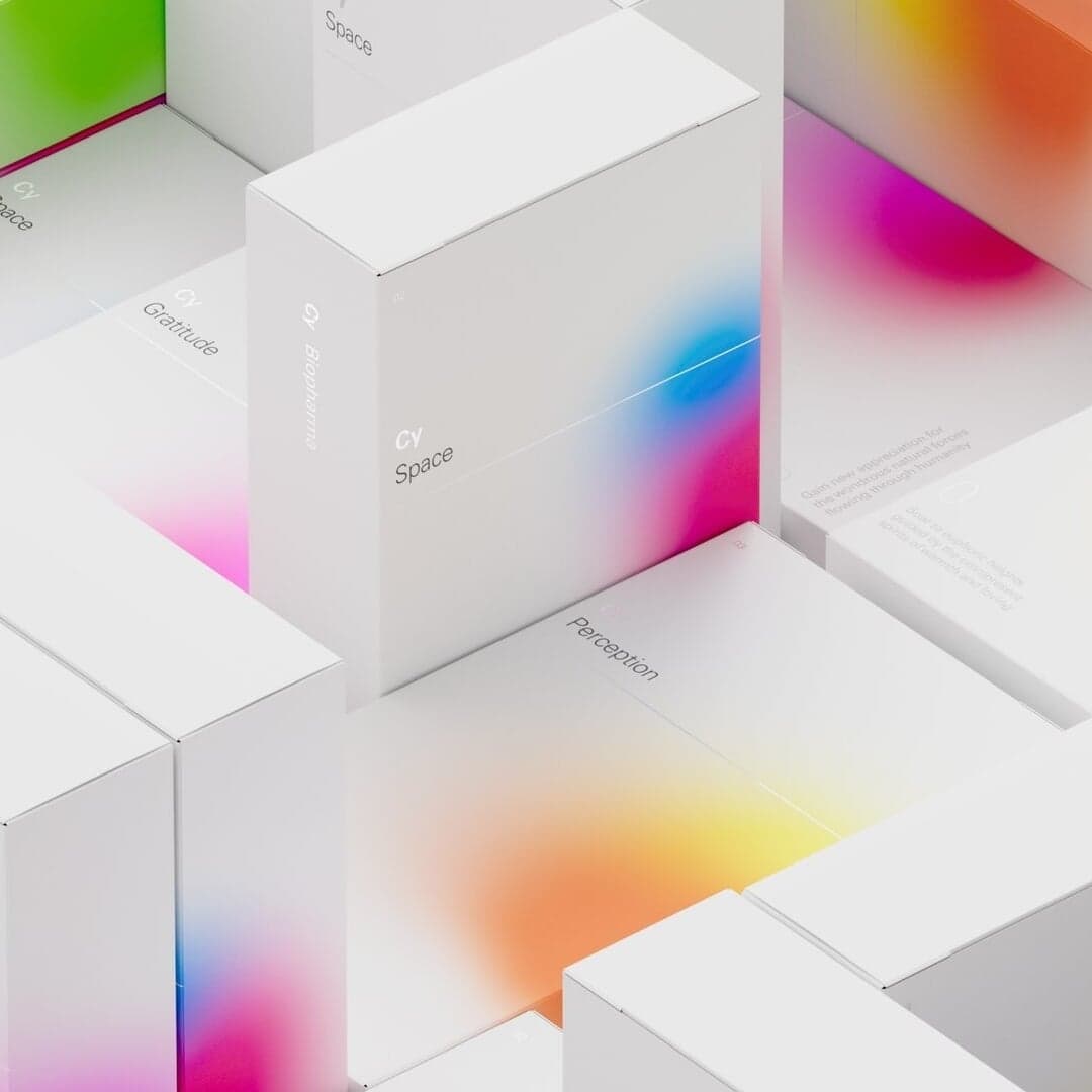
Set for Autumn, Cy Biopharma, Hotel Park Ave, Jim Jams, Olympic Crew, Schick Toikka
Cases set in Univers, as credited by the studios in their own writeups.
Elizabeth Goodspeed explores the growing trend of design studios creating their own custom typefaces as part of brand identity systems. The article examines how typography has evolved from a supporting role to a central brand asset, citing examples from studios like Koto, Order, and R&M. It argues that custom fonts offer brands originality, flexibility, and stronger visual ownership in an increasingly crowded design landscape.
Demande Spéciale developed a layered and transparent brand identity for Montreal-based architecture atelier at-at. Led by designer Maude Turgeon, the project draws inspiration from rhythm, materiality, and collaboration, using Univers typeface and a restrained palette of black, yellow, and blue. The modular system reflects the architects’ holistic and process-driven approach to design.
The Brand Identity features Order Type Foundry’s new sans serif typeface, Haltung, designed by Auckland-based Joe Moore. Drawing from the teachings of Walter Käch, Adrian Frutiger, and Emil Ruder, Haltung balances historical influences with a contemporary, airy aesthetic. The typeface offers seven weights with italics and aims to bring a lighter, expressive tone to neo-grotesk design.
The article explores the 1983 corporate identity for HongkongBank (later HSBC) designed by Henry Steiner. It details the historical context, design rationale, and symbolism behind the iconic red hexagon logo, which represented the bank’s East–West connections and Scottish heritage. The piece also notes the 2018 update to the identity, which Steiner criticized as unnecessary.