← Back to Fonts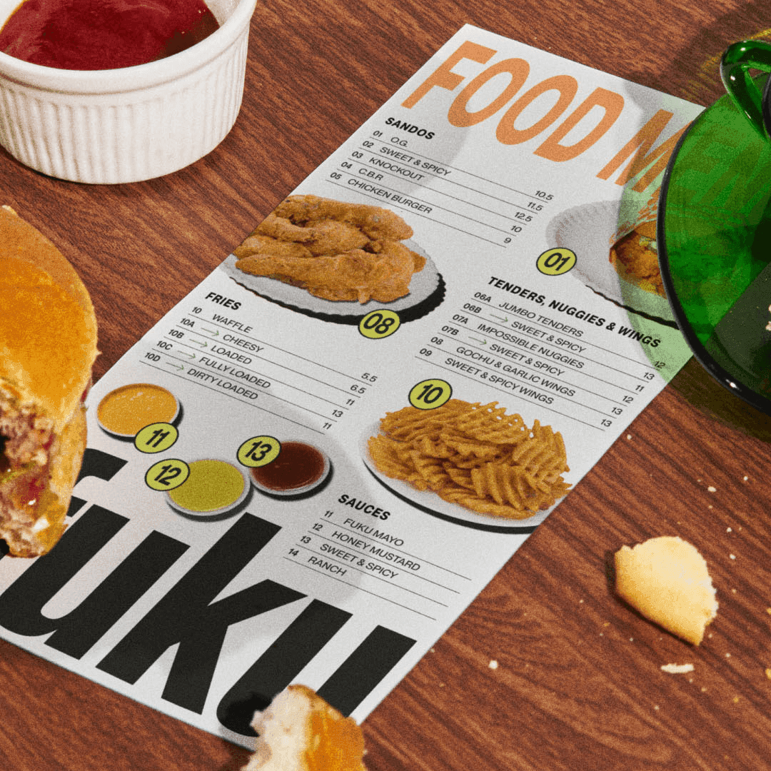
PP Right Serif — 1 case
Used by Red Antler
Set for Fuku
Cases set in PP Right Serif, as credited by the studios in their own writeups.
PP Right Serif in the news
- "Seesaw Unveils Boutique Hotel Brand for Fedrigoni's Paper Showcase"
The Brand Identity · Jul 28, 2025
Seesaw Studio collaborated with Spicers to create The Vellum, a fictional boutique hotel brand designed to showcase Fedrigoni’s specialty paper stocks. The project uses refined typography, restrained color palettes, and tactile print techniques to demonstrate the expressive potential of premium materials. The concept successfully merges storytelling and material craft, boosting Fedrigoni’s visibility and reaffirming print’s relevance in a digital era.
Seesaw StudioLetterformGunn & TaylorSpicersFedrigonibranding - Logo & Branding for Fuku by Red Antler
BP&O · Mar 27, 2025
BP&O features Red Antler’s rebrand for Fuku, the fast-casual chicken sandwich brand born from David Chang’s Momofuku. The identity combines bold typography from Pangram Pangram with Akzidenz-Grotesk, dynamic flash photography, and NYC-inspired signage. While the article praises the typography and art direction, it also questions some of the copywriting and visual choices.
- Red Antler Revamps Fuku Brand with Bold Rebranding
The Brand Identity · Dec 16, 2024
Red Antler rebranded New York-based fried chicken restaurant Fuku, refining its iconic wordmark while embracing the gritty, handmade energy of the city. The new identity combines a condensed sans logo with a dynamic type system inspired by street graphics and kitchen culture. The result is a bold, honest, and distinctly New York visual language that celebrates Fuku’s roots and personality.