← Back to Fonts
PP Right Grotesk — 2 cases
Cases set in PP Right Grotesk, as credited by the studios in their own writeups.
Cases set in PP Right Grotesk, as credited by the studios in their own writeups.
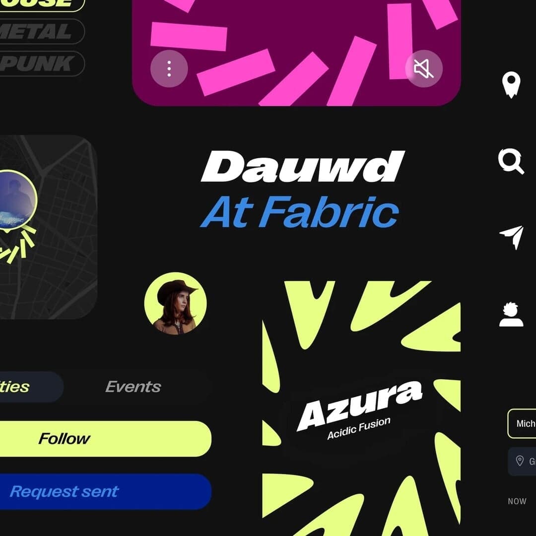
Budapest-based studio CM.SUPPLY created a vibrant, rave-inspired identity and app experience for trppn, a decentralized music community platform. The design draws from 1990s club culture, using a dynamic visual system, distorted typography, and motion tools to empower trppn’s community to generate their own assets. The project blends nostalgia with digital innovation to connect Gen-Z and older audiences alike.
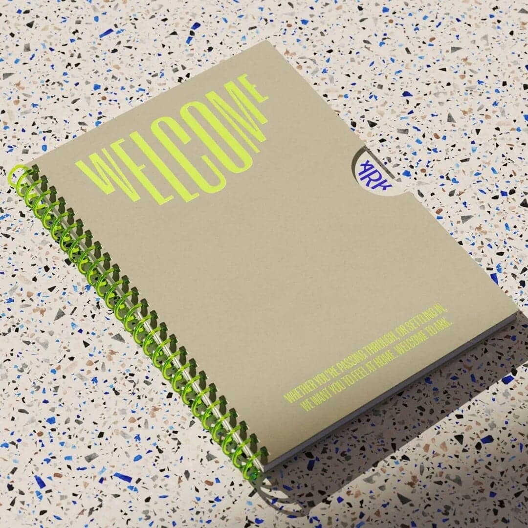
BP&O’s feature by Emily Gosling reviews OMSE’s branding for Ark, a co-living property development in Wembley, London. The identity centers on a semicircular motif inspired by the name and uses Right Grotesk type to balance friendliness and functionality. While the article critiques Ark’s affordability claims, it praises OMSE’s design for being smart, flexible, and visually cohesive across digital and physical applications.
The Brand Identity features Freddie Hall’s design for Juump, a virtual queueing app aiming to modernize waiting experiences. Hall created a copy- and type-led identity combining Reckless Neue, Denim, and Right Grotesk, paired with historical Rowlandson illustrations from the British Library to balance modernity and nostalgia. The result is a playful, time-conscious brand system that visually echoes the rhythm of queueing.
GrandArmy developed a comprehensive rebrand for vintage watch retailer Analog:Shift, creating a flexible identity system inspired by horological history and passion. The project includes a custom-modified wordmark, a suite of monograms, and a color system referencing iconic timepieces. The identity balances historical richness with modern neutrality through typography, illustration, and animation.