← Back to Fonts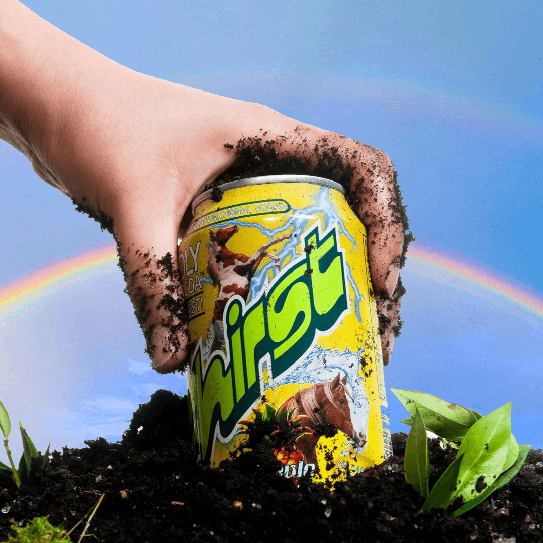
Frankfurter — 1 case
Used by Mother Design
Set for Fhirst
Cases set in Frankfurter, as credited by the studios in their own writeups.
Frankfurter in the news
- Frontify presents: Mother Design and Fhirst’s fearless collaboration
The Brand Identity · Nov 13, 2025 · Interview
The Brand Identity’s Dialogue series, presented by Frontify, spotlights Mother Design’s collaboration with probiotic soda startup Fhirst. The partnership produced a bold, maximalist brand identity that defies the minimalist norms of the wellness beverage category. Through mutual trust and creative courage, both teams crafted a vibrant visual and verbal system that celebrates science with joy rather than seriousness.
- Branding for Fhirst by Mother Design
BP&O · Oct 14, 2025
BP&O’s feature by Emily Gosling explores Mother Design’s exuberant rebrand for probiotic soda Fhirst. The identity embraces a maximalist Y2K-inspired aesthetic, combining multiple retro typefaces, bright gradients, and playful illustrations to differentiate the brand in a crowded health beverage market. The project balances joyful chaos with functional clarity, supported by motion design and a bold color system.
- Mother Design Revamps Fhirst Soda with Joyful, Maximalist Branding
Creative Boom · Sep 3, 2025
Mother Design created a bold, maximalist brand identity for Fhirst, a new probiotic soda founded by Catherine and Steven Van Middelem. Rejecting the minimalist aesthetics common in wellness drinks, the identity embraces nostalgic typography, bright gradients, and playful mascots to express joy and individuality. The project positions Fhirst as a science-backed yet fun alternative in the functional beverage market.
- Chris Chapman Revitalizes Agua de Madre Identity with Joyful Typography
The Brand Identity · Jun 10, 2025
Designer Chris Chapman reimagined the identity for East London-based water kefir brand Agua de Madre. The new branding embraces maximalist typography, nostalgic references, and vibrant color to capture the drink’s effervescent and joyful character. Retaining the original smiling ‘madre’ logo, Chapman balanced heritage with expressive modern design to stand apart from minimal health drink aesthetics.
Chris ChapmanAgua de Madrebranding - Agua de Madre Unveils Nostalgic Branding Celebrating Mother Culture
It's Nice That · Jan 6, 2025
The article profiles London-based designer Chris Chapman’s rebrand of Agua de Madre, a sparkling water kefir brand. Drawing on childhood nostalgia and the drink’s ‘mother culture’, the identity uses a mix of vibrant colours, eclectic typefaces, and sticker-like graphics to convey playfulness and taste. The result is a joyful, contemporary brand that stands out in the health drink market.
Adam&EveAgua de Madrebranding