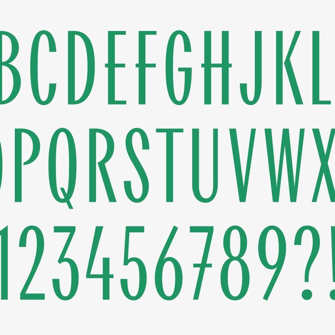
Maria Doreuli’s foundry, working across Latin and Cyrillic. Visit Contrast Foundry →
Contrast Foundry typefaces credited by studios in their case writeups.
Creative studio Lucky Dip has rebranded employee engagement platform Relesys with a bold, sports-inspired identity centered around a podium motif and a punchy red palette. The rebrand shifts focus from technology to people, using custom typography, hand-drawn illustrations, and a motivational tone to position Relesys as 'The Motivator' in its industry. The new system includes a website, digital toolkit, and flexible brand assets that empower the internal team to champion the brand.
Manychat’s in-house design team developed a lively and expressive identity for the Instagram Summit 2024, emphasizing creator culture and emotional connection. The design combines geometric precision with organic, scribbly forms, supported by a vibrant color palette and expressive chat bubble motifs. Typography choices maintain brand consistency while allowing flexibility and energy across event materials.
The Brand Identity features Contrast Foundry’s new serif typeface CoFo Holz, designed by Nikita Sapozhkov. Inspired by woodcut techniques and historical type specimens, the font balances sharp and soft details to achieve both expressive display and readable text use. The article explores its design process, historical influences, and Sapozhkov’s vision for its creative applications.
Creative Boom’s article by Tom May highlights 36 fonts expected to trend in 2022, exploring the evolution of typography after the pandemic. It discusses key movements such as retro revivals, sustainability, accessibility, and the rise of custom and variable fonts. Designers and studios share insights on how type design is adapting to inclusivity, technology, and brand differentiation.