← Back to Fonts
Eurostile — 1 case
Used by Dinamo
Set for Dinamo
Cases set in Eurostile, as credited by the studios in their own writeups.
Eurostile in the news
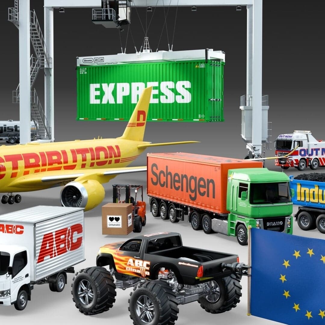
- Dinamo and Seb McLauchlan’s ABC Schengen fuses Helvetica and Eurostile
The Brand Identity · May 28, 2026
The Brand Identity features Dinamo’s latest type release, ABC Schengen, a six-year collaboration with Seb McLauchlan and Luke Charsley. The type system merges Helvetica and Eurostile influences into 108 styles inspired by the Eurozone’s industrial and logistical aesthetics. The project explores the tension between functional design and cultural identity, resulting in a versatile, variable type family spanning multiple scripts.
Dinamotype_design - Get in, loser! Dinamo’s auto-inspired typeface has arrived, with 108 fonts in the boot
It's Nice That · Feb 27, 2026
Dinamo has launched ABC Schengen, a new auto- and industry-inspired typeface family designed by Seb McLauchlan with Luke Charsley. Six years in development, the project explores the visual language of European trade, transport, and manufacturing, resulting in 108 fonts and three companion revivals. The article delves into the design process, inspirations, and collaborative nature of the release.
Dinamotypography - Chris Chapman Revitalizes Agua de Madre Identity with Joyful Typography
The Brand Identity · Jun 10, 2025
Designer Chris Chapman reimagined the identity for East London-based water kefir brand Agua de Madre. The new branding embraces maximalist typography, nostalgic references, and vibrant color to capture the drink’s effervescent and joyful character. Retaining the original smiling ‘madre’ logo, Chapman balanced heritage with expressive modern design to stand apart from minimal health drink aesthetics.
Chris ChapmanAgua de Madrebranding - Agua de Madre Unveils Nostalgic Branding Celebrating Mother Culture
It's Nice That · Jan 6, 2025
The article profiles London-based designer Chris Chapman’s rebrand of Agua de Madre, a sparkling water kefir brand. Drawing on childhood nostalgia and the drink’s ‘mother culture’, the identity uses a mix of vibrant colours, eclectic typefaces, and sticker-like graphics to convey playfulness and taste. The result is a joyful, contemporary brand that stands out in the health drink market.
Adam&EveAgua de Madrebranding - Designing in squares: Erkin Karamemet takes us on the historical journey behind his Modena typeface
The Brand Identity · Jun 8, 2023 · Interview
The article is a guest feature by type designer Erkin Karamemet, translated and contextualized by Ferdinand Ulrich, exploring the conceptual and historical background of his new typeface Modena. It traces the geometric and typographic lineage of square-based letterforms, referencing figures like Piet Hein, Alessandro Butti, and Hermann Zapf. Karamemet discusses Modena’s design process, variable font structure, and the balance between optical correction and geometric precision.
typography - Rice Studios’ identity for Rooster strips the Vietnamese ‘anti-craft beer’ of American stereotypes
The Brand Identity · Aug 13, 2020
Rice Studios created a new identity for Vietnamese brewery Rooster Beers, formerly Phat Rooster Ales, aiming to remove American craft beer stereotypes and embrace a more local, accessible aesthetic. The branding combines classic beer styling with bold colors, witty copywriting, and a comprehensive range of deliverables including packaging, apparel, and delivery vehicles. The result positions Rooster as a friendly, community-oriented brand within Vietnam’s growing craft beer scene.
Rice StudiosRooster Beersbranding