← Back to Fonts
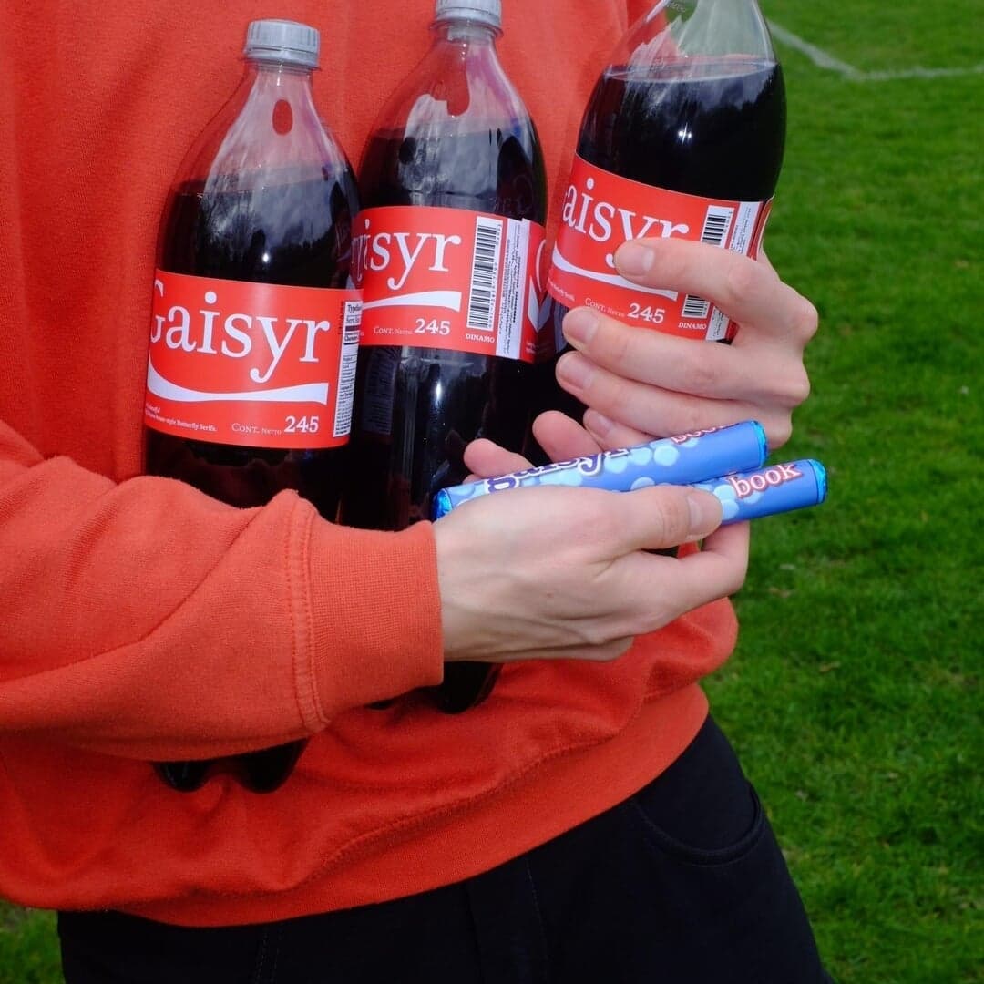
ABC Gaisyr — 1 case
Used by Dinamo
Set for Dinamo
Cases set in ABC Gaisyr, as credited by the studios in their own writeups.
ABC Gaisyr in the news
- Nihilo Launches Premium Rum Brand "Esther" to Transform Category
The Brand Identity · Aug 6, 2025
The Brand Identity features Nihilo’s creation of Esther, a premium Colombian rum brand designed to redefine the rum category. The Columbus-based studio, led by Emunah Winer and Margarett Kerr-Jarrett, developed a bold identity centered on duality, optical illusions, and cultural relevance. With distinctive typography, a memorable green cap, and anti-cliché positioning, Esther aims to modernize rum’s image and appeal to a broader audience.
- Companion–Platform Designs Season-Adaptive Logo for Uncommon Fruits
It's Nice That · May 20, 2025
Companion–Platform created a variable, seasonally adaptive identity for Uncommon Fruits, a research initiative by Robida Collective exploring fruit trees and edible ecology. The identity features a flexible logo system inspired by natural growth and uses typefaces Cerial and Gaisyr to balance familiarity with organic form. The website extends this concept through an 'orchard of words' that encourages exploratory navigation.
Companion–PlatformRobida CollectiveUncommon FruitsRobida Collectivebranding - "Five Serif Typefaces Redefining Brand Identities"
The Brand Identity · Apr 10, 2025
The article by Poppy Thaxter highlights five serif typefaces—Domaine, GT Alpina, Panama, ABC Gaisyr, and ABC Arizona—that have made a strong impression across recent brand identity projects. It showcases how various studios have applied these fonts in branding for clients across art, hospitality, technology, and culture sectors. The piece emphasizes the expressive and enduring qualities of serif typography in contemporary design.
- “An evolution rather than a restart.” Studio Ground Floor on designing The Interviews: Volume Two
The Brand Identity · Jan 25, 2024 · Interview
The Brand Identity interviewed Studio Ground Floor’s co-founders Alice Sherwin and Harry Bennett about their design for The Interviews: Volume Two, a continuation of the publication series documenting conversations with global design studios. The duo discussed evolving their original design system from Volume One, using a single typeface, and introducing new structural and visual elements such as a glossy image section and bold cover typography. The article explores their process, design decisions, and reflections on editorial design as a medium.
Studio Ground FloorThe Brand IdentityThe Brand Identityeditorial - PARTERRE subdued identity for Max Manavi-Huber reflects the humanity and technicality in his work
The Brand Identity · Apr 24, 2023
Vienna-based studio PARTERRE created a subdued yet tactile identity for photographer Max Manavi-Huber, inspired by his analogue and nature-focused work. The design uses earthy tones, uncoated papers, and Dinamo’s Gaisyr typeface to balance technical precision with human warmth. The project extends across print and digital touchpoints, including a website and stationery suite.
PARTERREInfinitive FactoryMax Manavi-Huberbranding - Studio Ground Floor reflect on the design process behind our book, The Interviews: Volume One
The Brand Identity · Jul 22, 2021 · Interview
The Brand Identity interviewed Studio Ground Floor about their design process for 'The Interviews: Volume One,' a book compiling 57 interviews with design studios. The studio discussed their archival-inspired approach, typographic choices from Dinamo, and the conceptual details that make the book both timeless and contemporary. The project highlights Studio Ground Floor’s editorial expertise and thoughtful material choices like a PVC cover and Olin paper.
Studio Ground FloorThe Brand IdentityThe Brand Identityeditorial