Lake Of Bays Brewing Co. Design Cases
1 case across 1 studio
News & interviews
- The Six-Pack That Counts Down Your Beers So You Don't Have To
· May 11, 2026
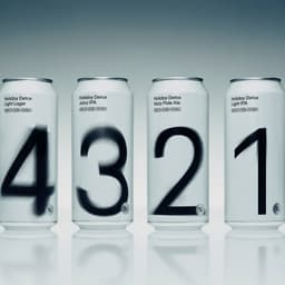
Leo Design created a conceptual six-pack for Lake of Bays Brewing Co. that visually counts down from a 5% stout to a 0% pale ale. Each can features a large numeral that transitions from blurred to sharp as the alcohol content decreases, using a minimalist black-and-white typographic system. The design rejects typical craft beer visuals in favor of a unified, concept-driven aesthetic.
Leo DesignLake of Bays Brewing Co.packaging - Leo Design uses blurred numbers to chart a six-day path to Dry January
The Brand Identity · May 7, 2026
Leo Design created the Holiday Detox Pack for Lake of Bays Brewing Co., a six-day beer set that visually represents a gradual reduction in alcohol content through blurred numerals. The Toronto studio used a custom Dinamo typeface, Leo Repro, and hand-treated each number to reflect increasing clarity. The minimalist packaging was initially a client gift and may expand into the brewery’s product line.